Building a robust Visual Brand Language (VBL)
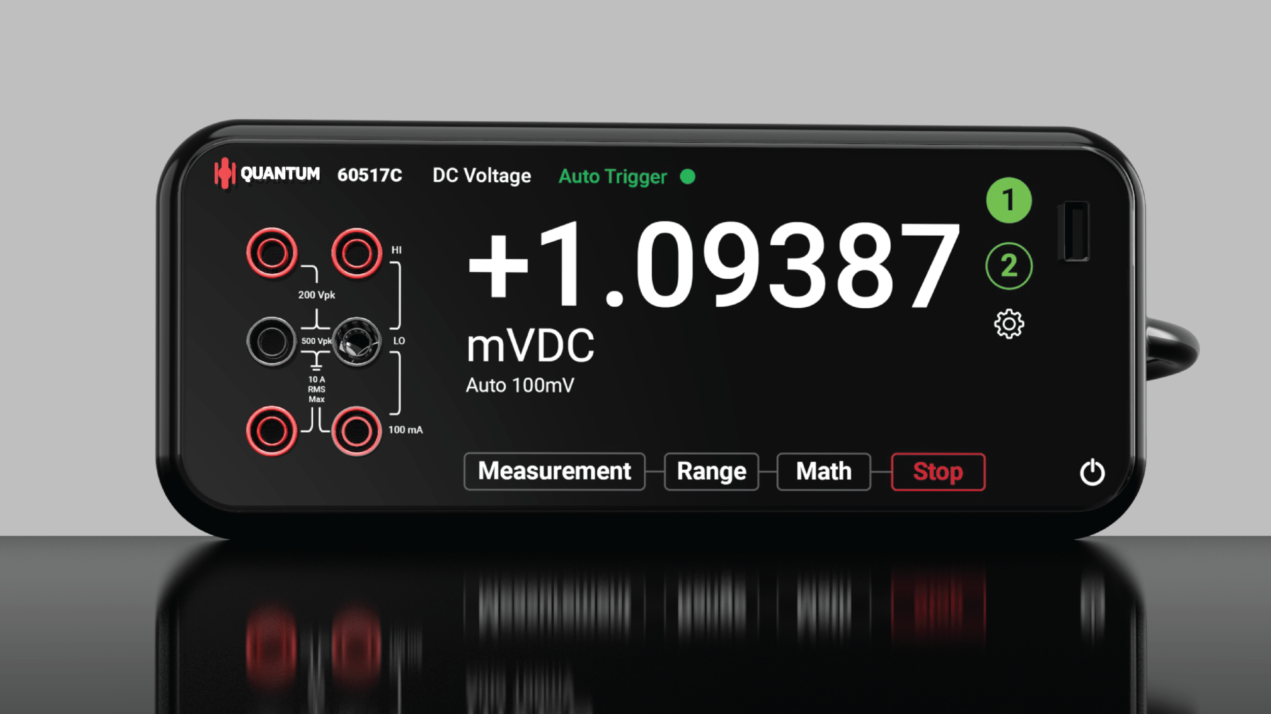
Quantum Scientific is an electronic testing equipment manufacturer. Their products include digital multimeters, waveform generators, and a myriad of other industry related electronic-testing equipment machines.
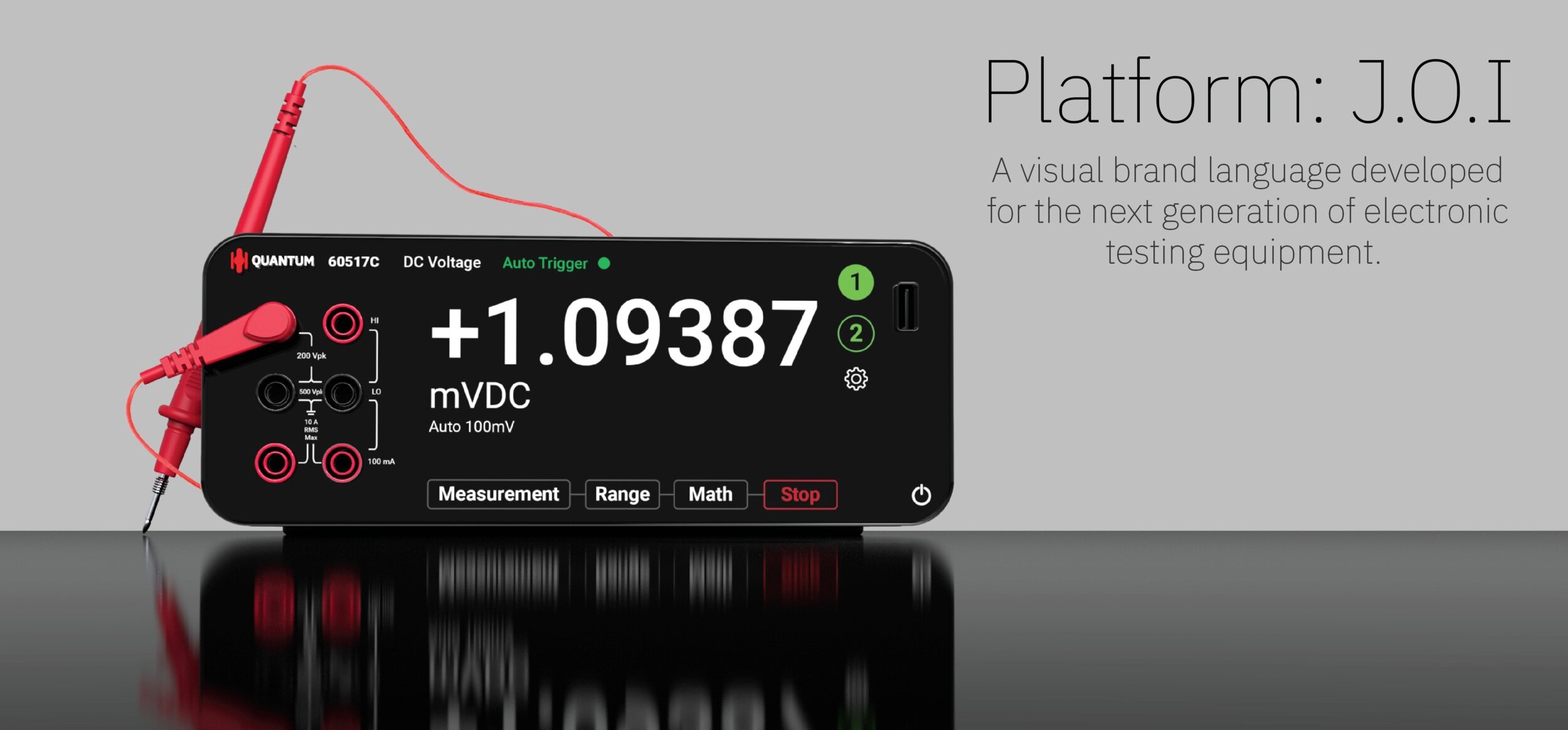
Currently, Quantum is seeking to establish a stronger visual brand language (VBL) to better communicate the brand across their entire product portfolio. They have chosen the digital multimeter as the first product to be redesigned due to its popularity.
A BRIEF (VISUAL) HISTORY OF
THE DIGITAL MULTIMETER.
By examining the progression of digital multimeters over time, what insights can we use to guide the design process going forward?
Research
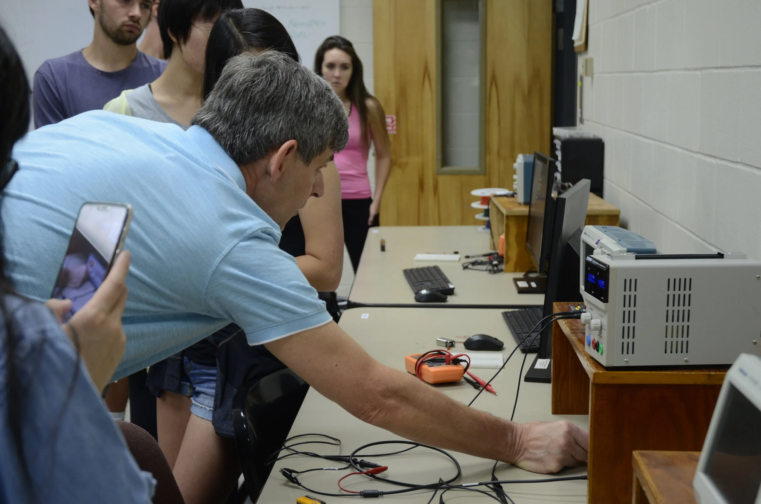
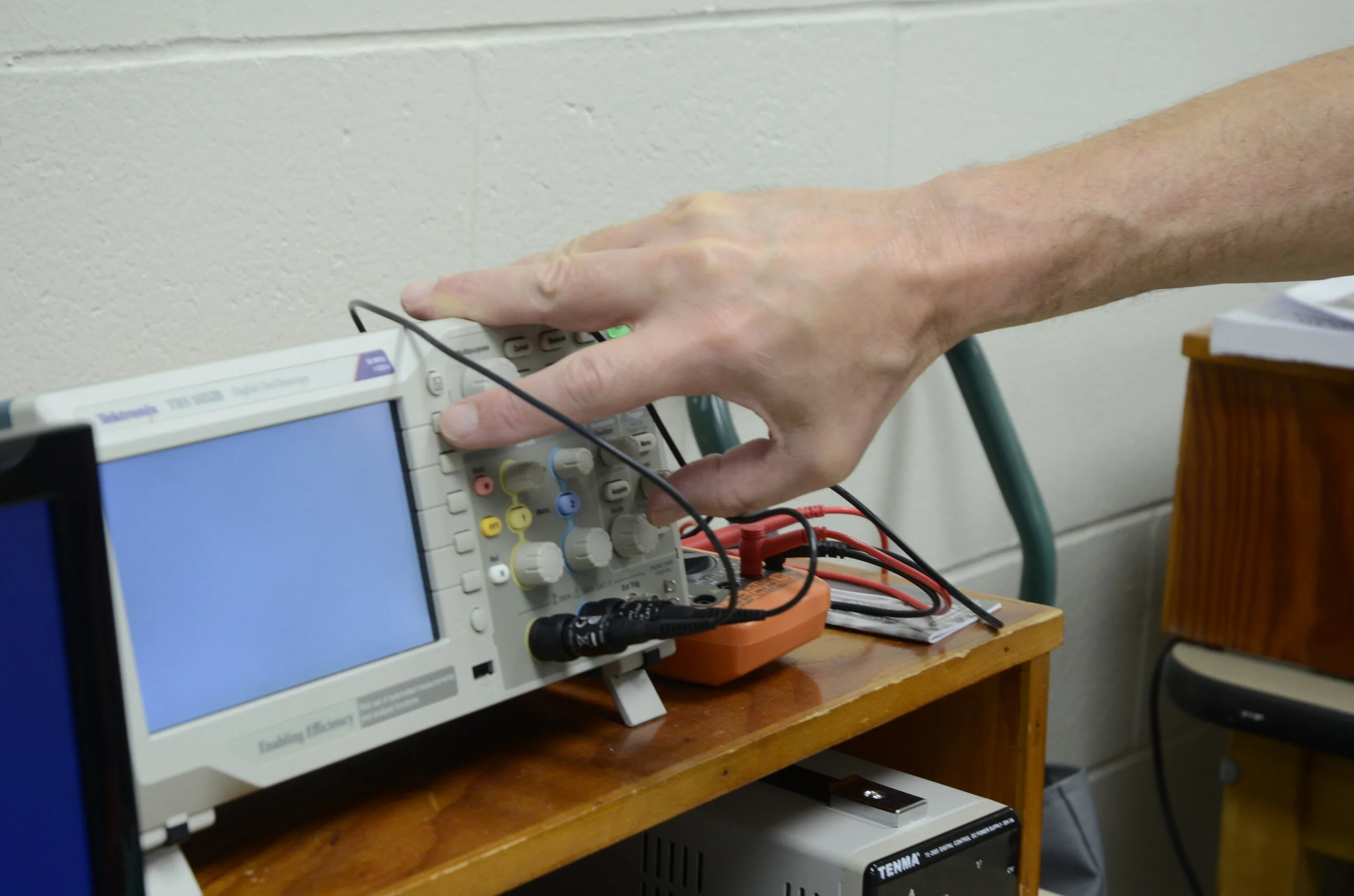
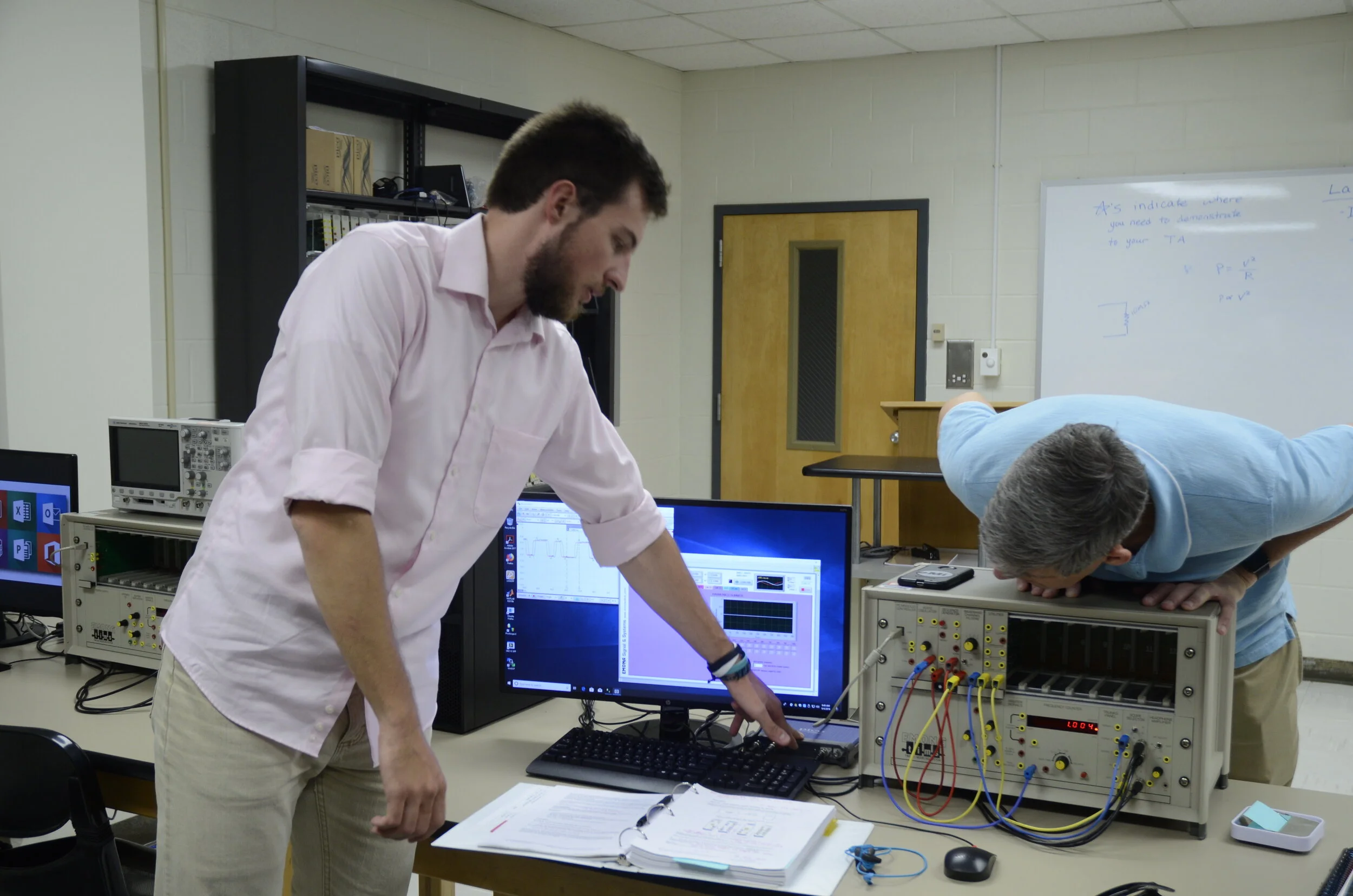
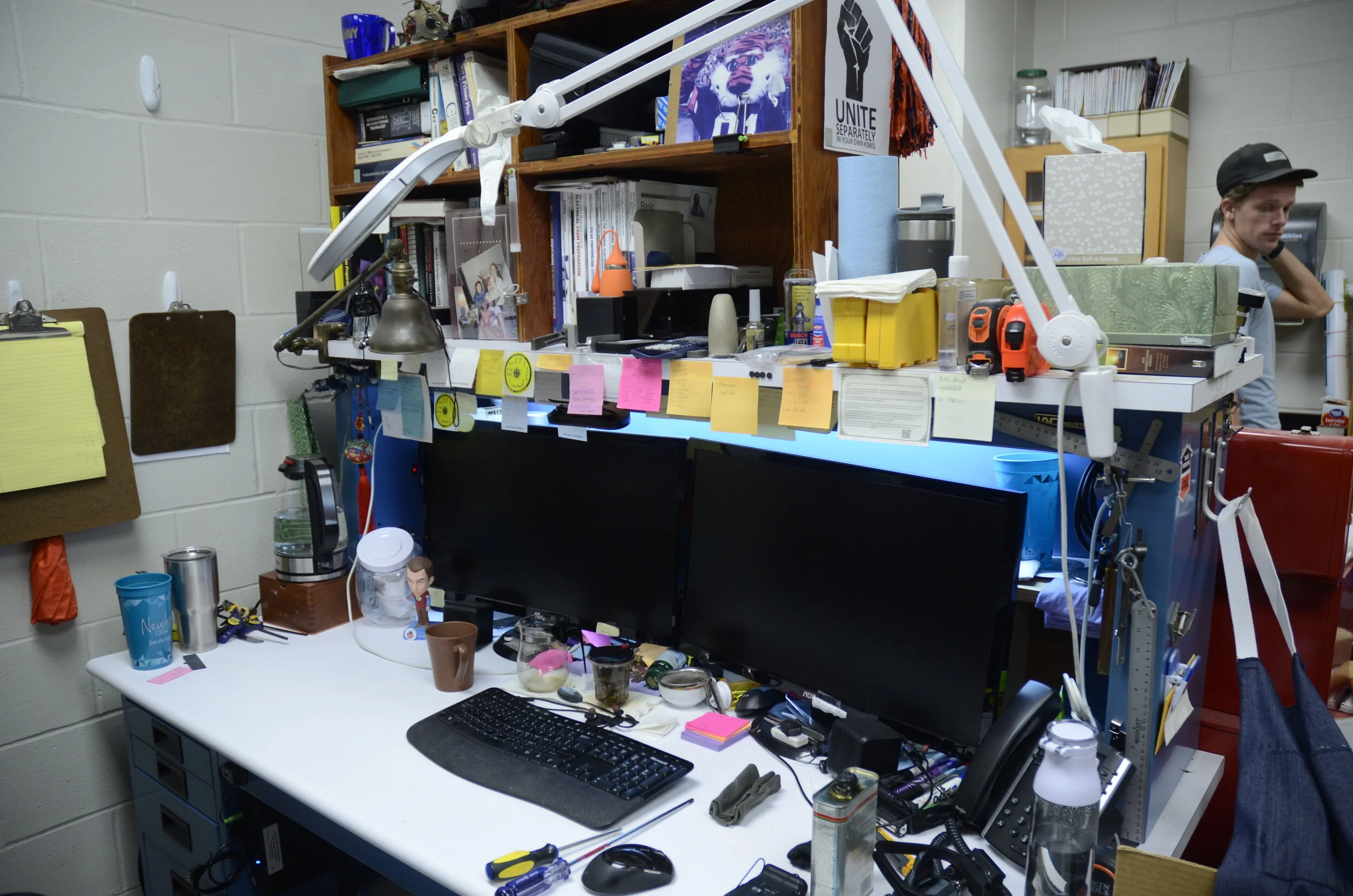
Field Research
Taking a tour of a functioning
electrical-engineering lab
helped to familiarize the setting
in which the products are used.
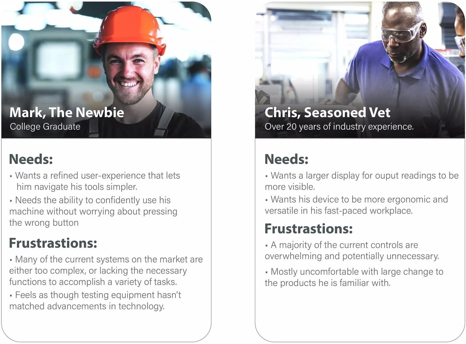
Personas:
Personas were created in order
to empathize with the users
being designed for.
Insights gleaned from initial
product, market and
user-research were used to
help establish a more accurate
depiction of the end-users.
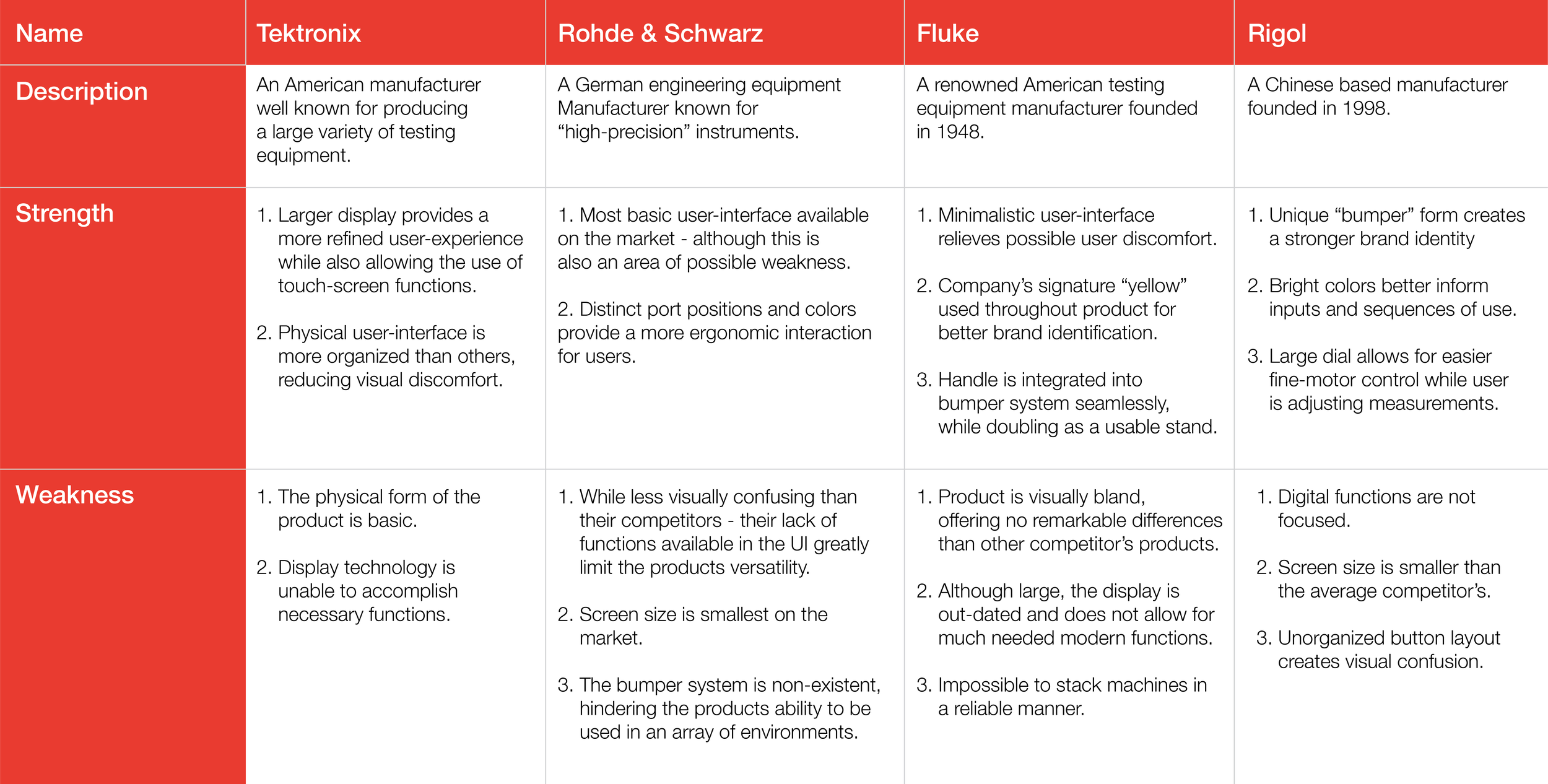
Competitive Analysis
A look at competitors products reveals areas in which to take inspiration
from (strengths), and features where improvement could be
implemented (weaknesses).
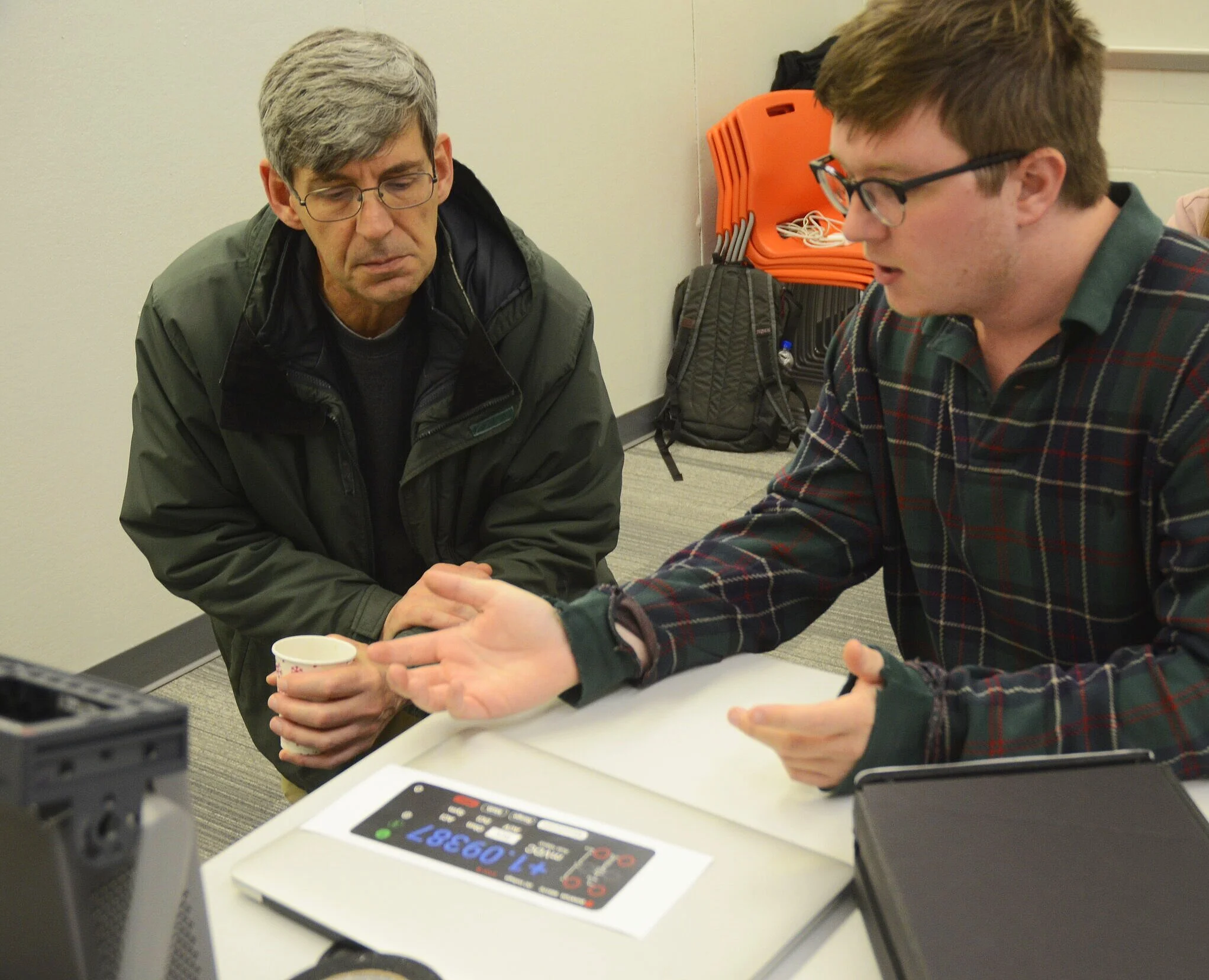
Interviews/Prototyping
User interviews were conducted
to better understand how real
industry professionals interact
with the current generation of
digital multimeter products.
People ranging from university
professors to industry veterans
were invited to participate in
testing the current concepts in
development.
Design
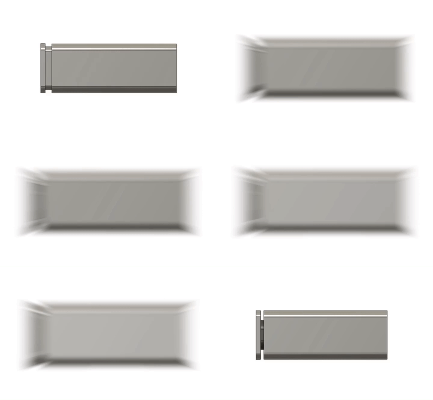
CAD Exploration
Having chosen a direction for
the form of the product, it was
necessary to begin iterating in
CAD so that exact dimensions
could be determined.
Overall screen size, thickness,
and offset from the main body
were the key measurements to
determine.
These aspects of the product
will influence the shape of the
rest of the body.
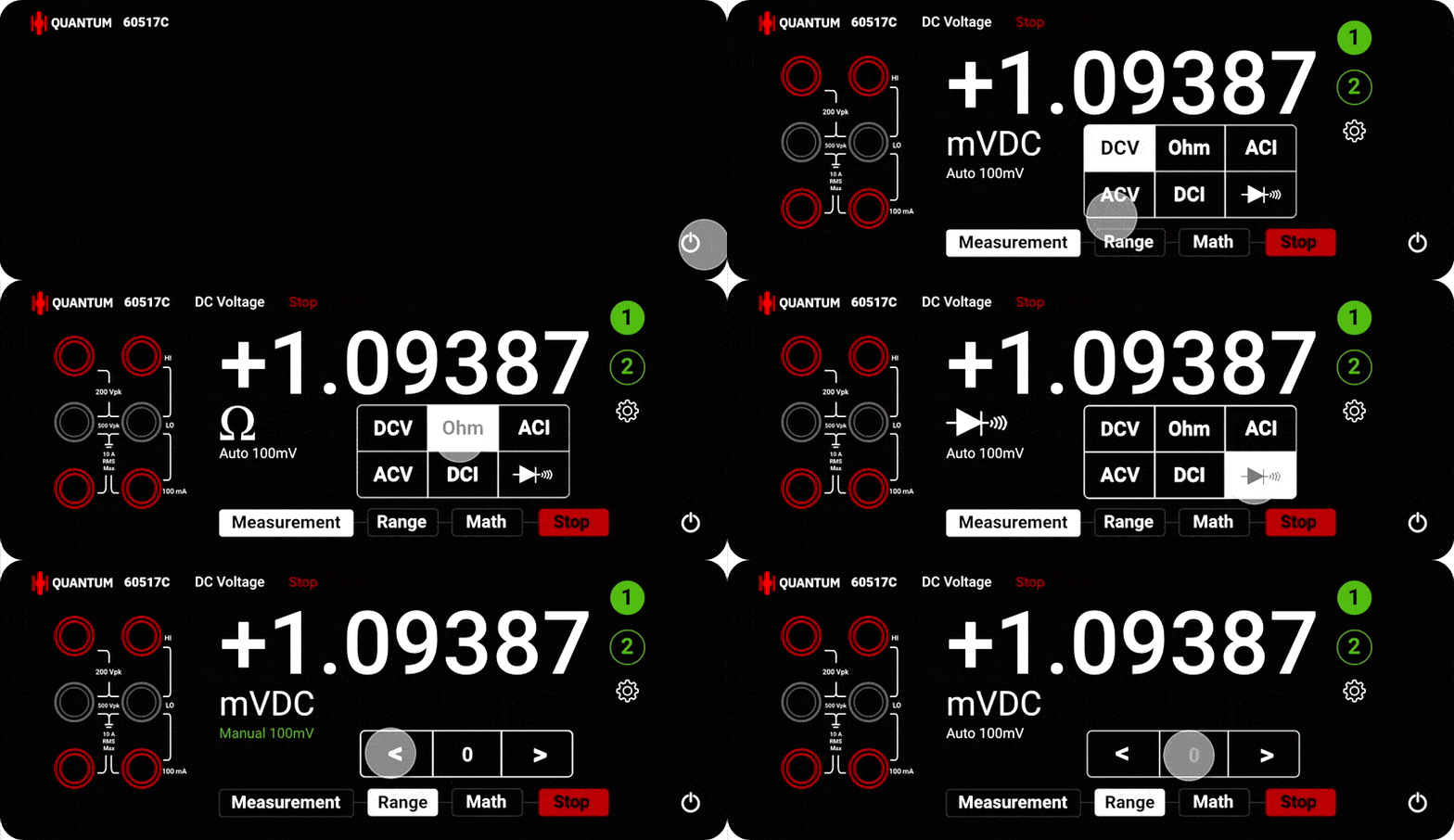
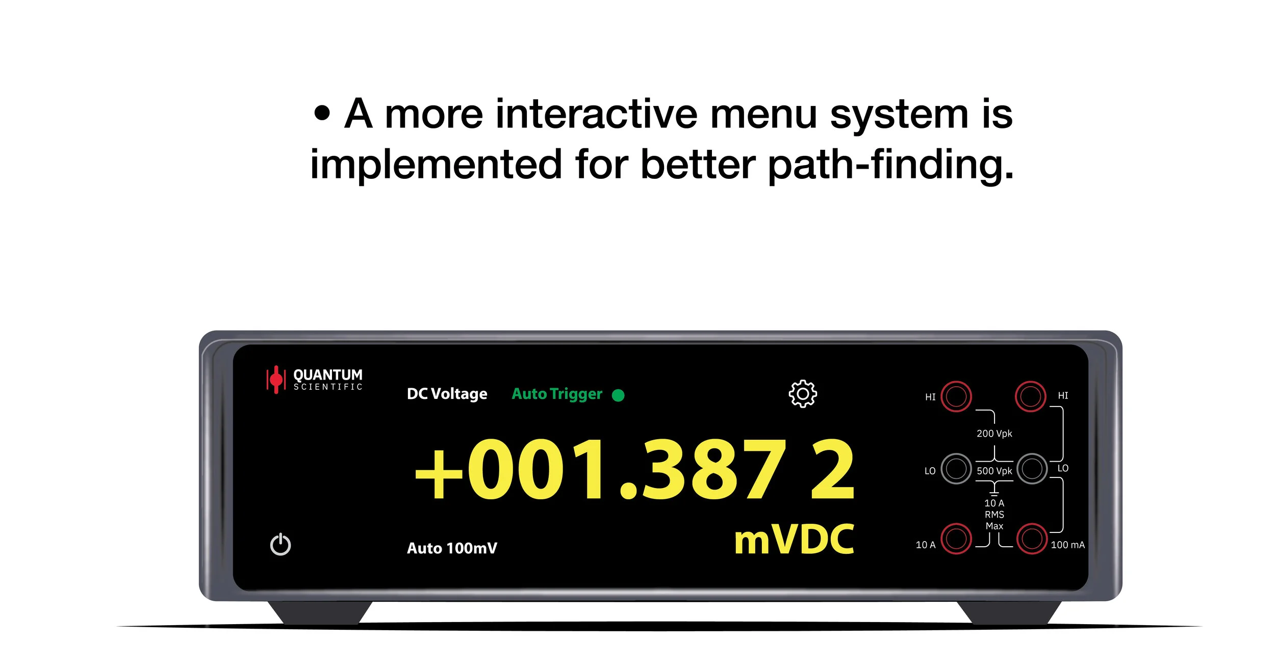
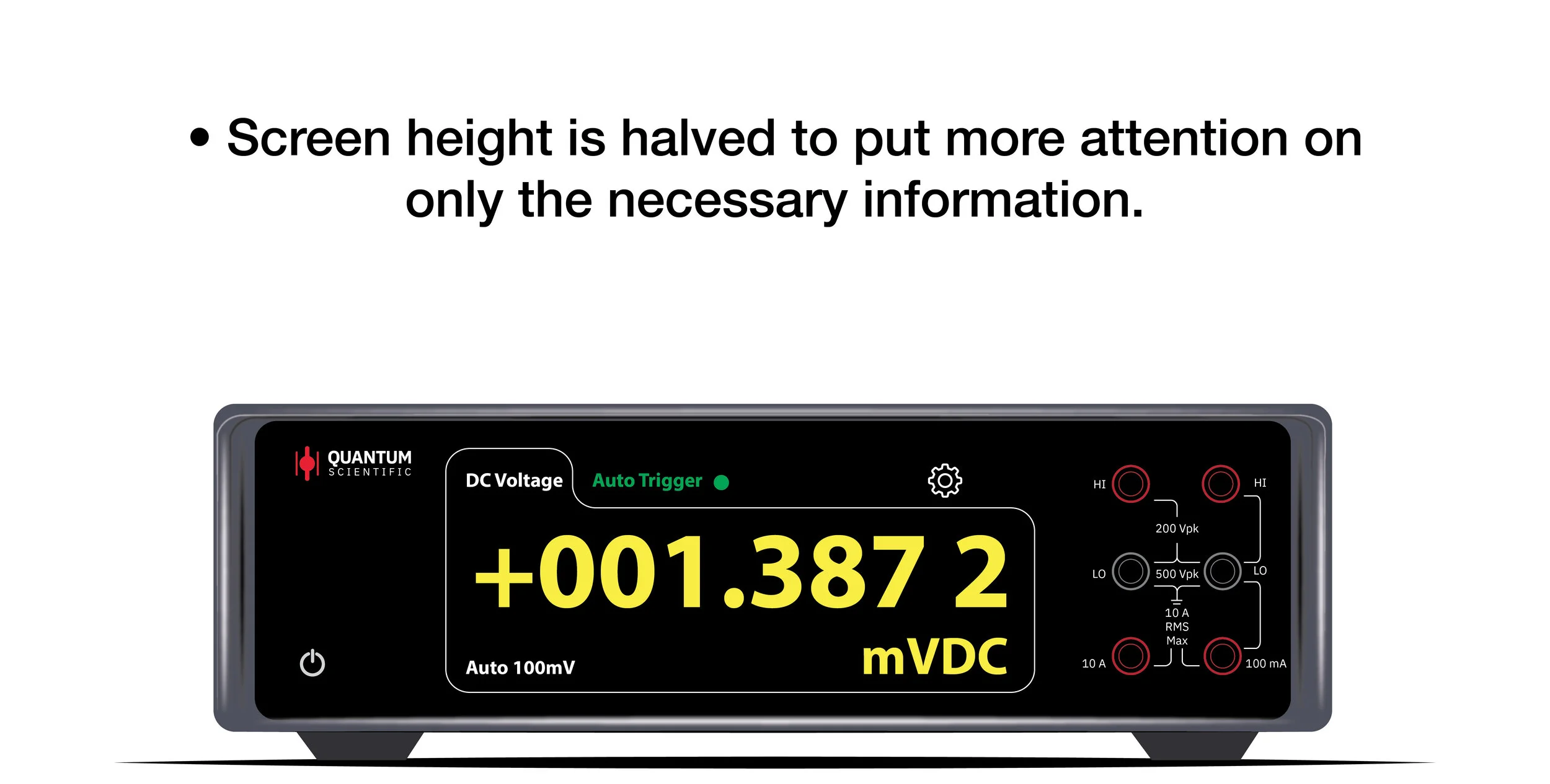
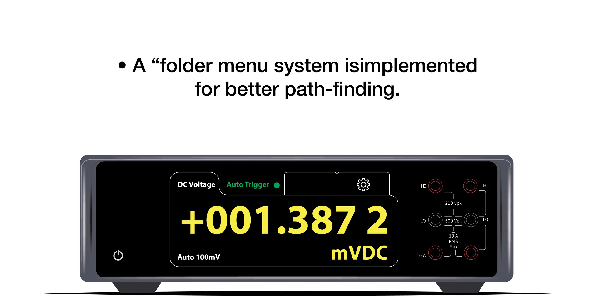
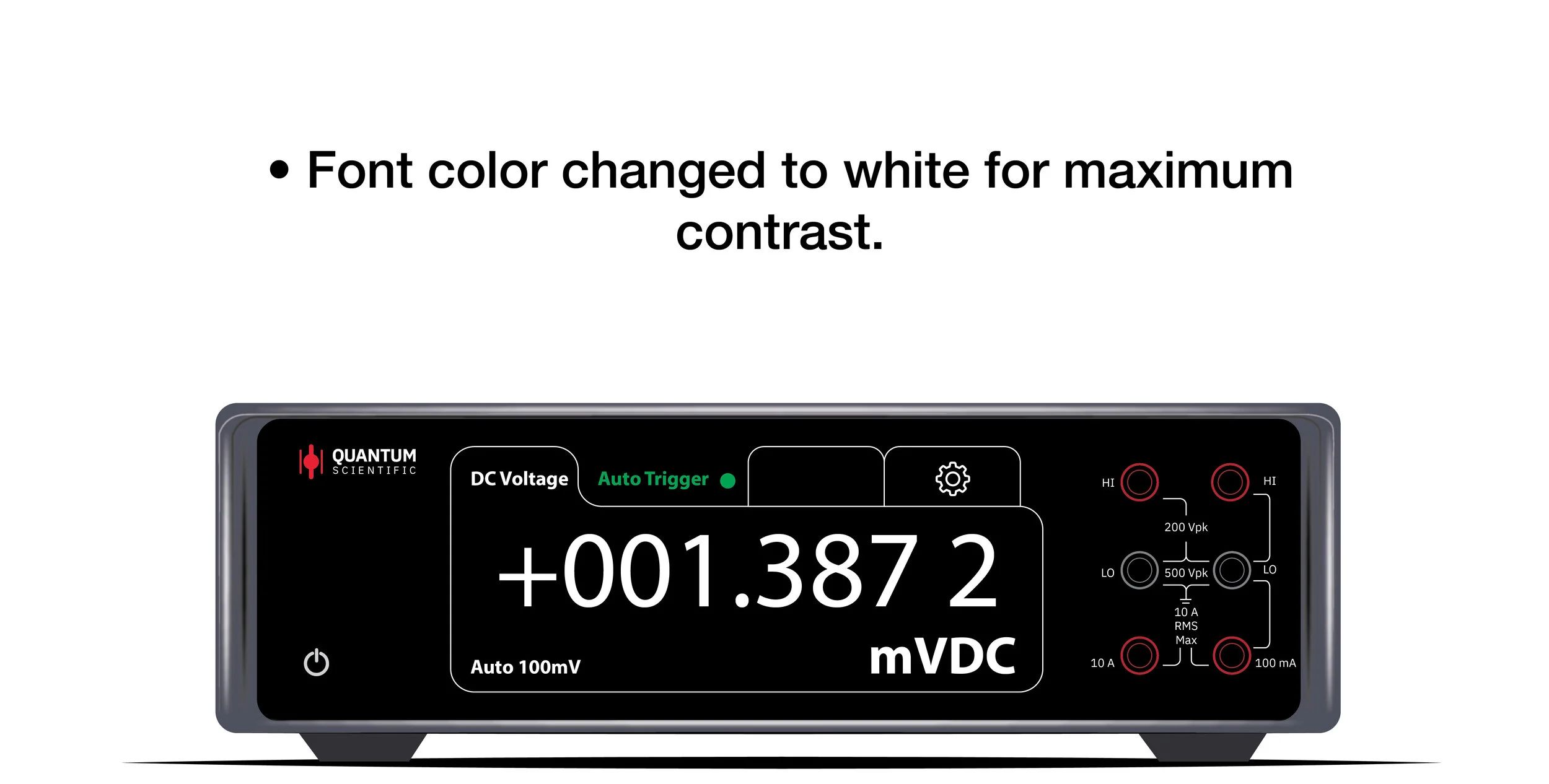
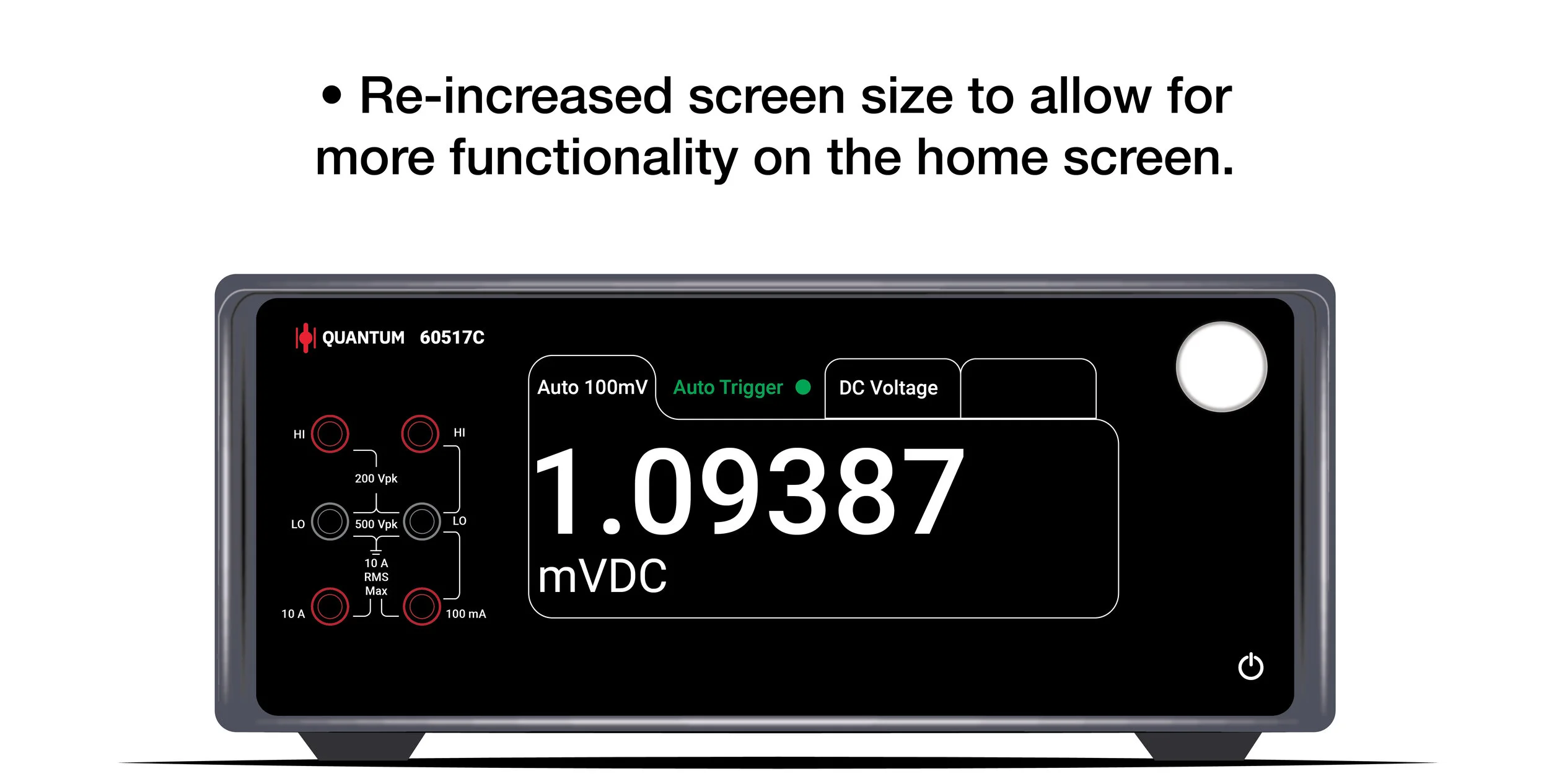
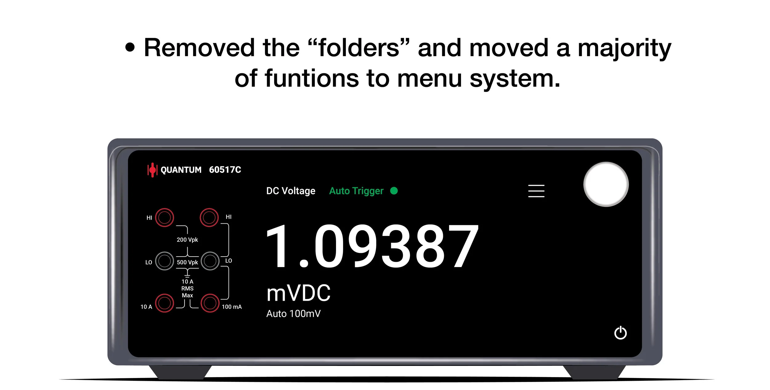
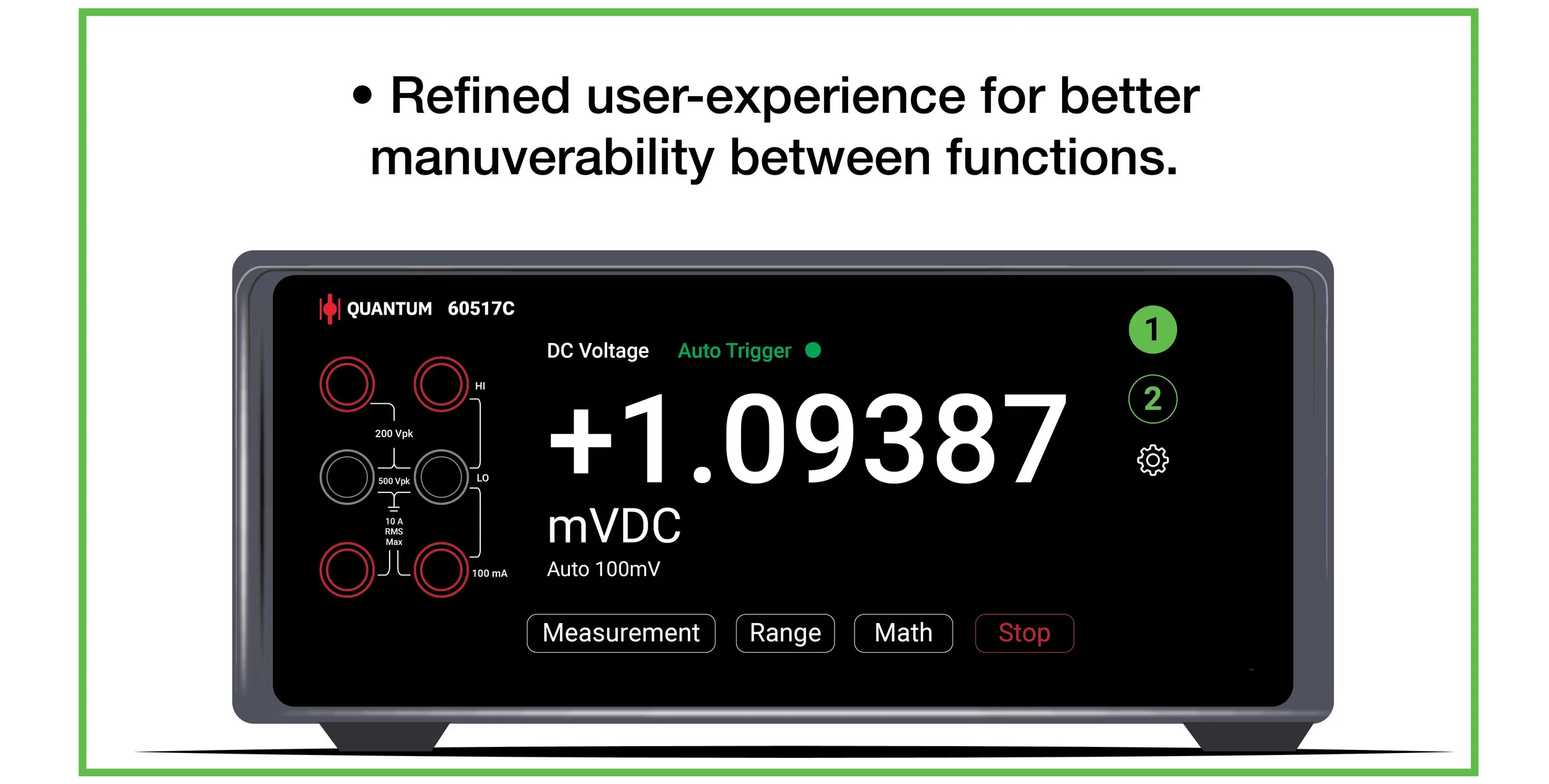
User Interface Exploration
Once the physical form started
to become more finalized, it was
time to begin crafting the user
interface.
By creating a large number of
iterations, the screen’s user
interface becomes increasingly
more refined.
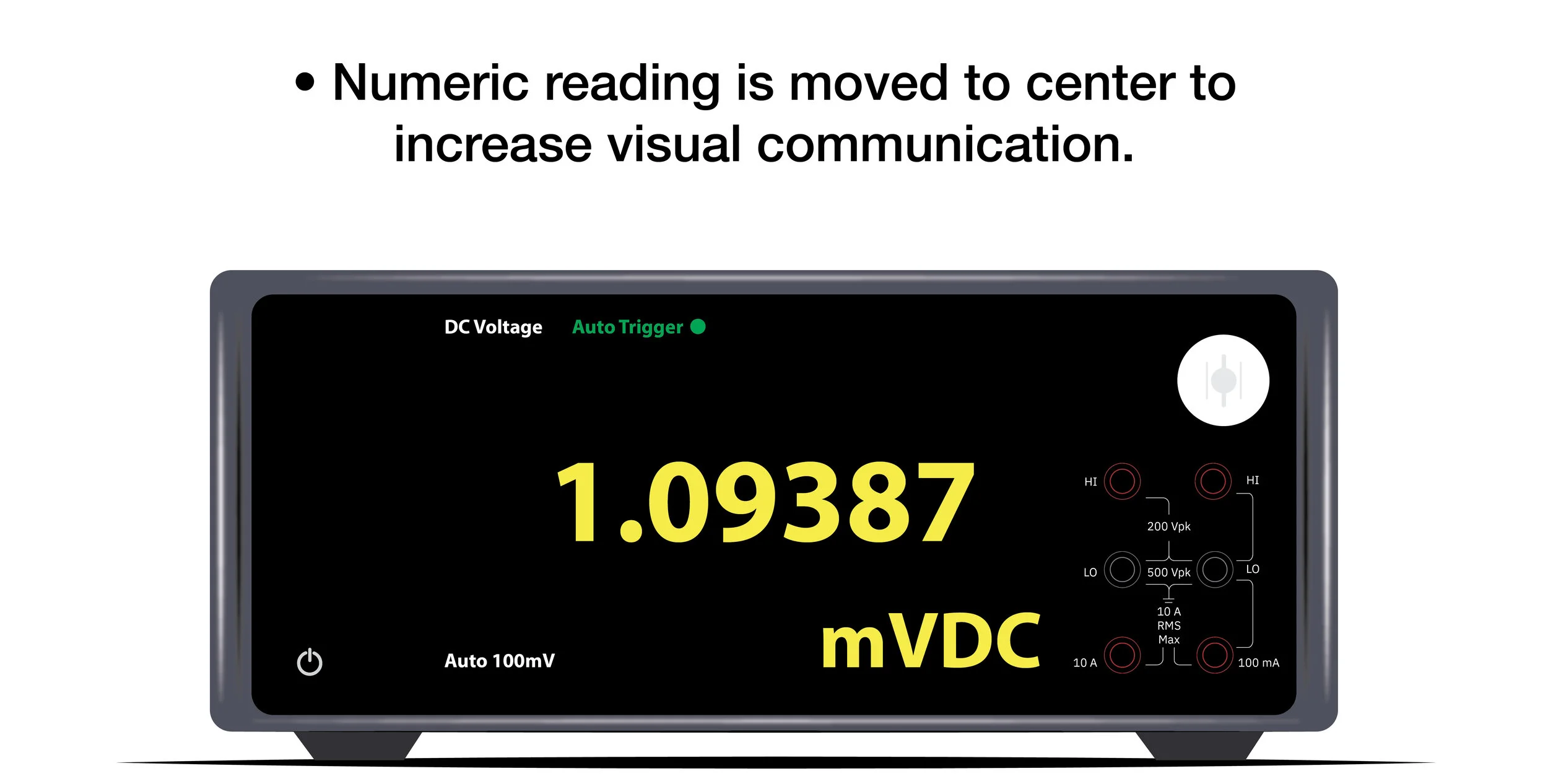
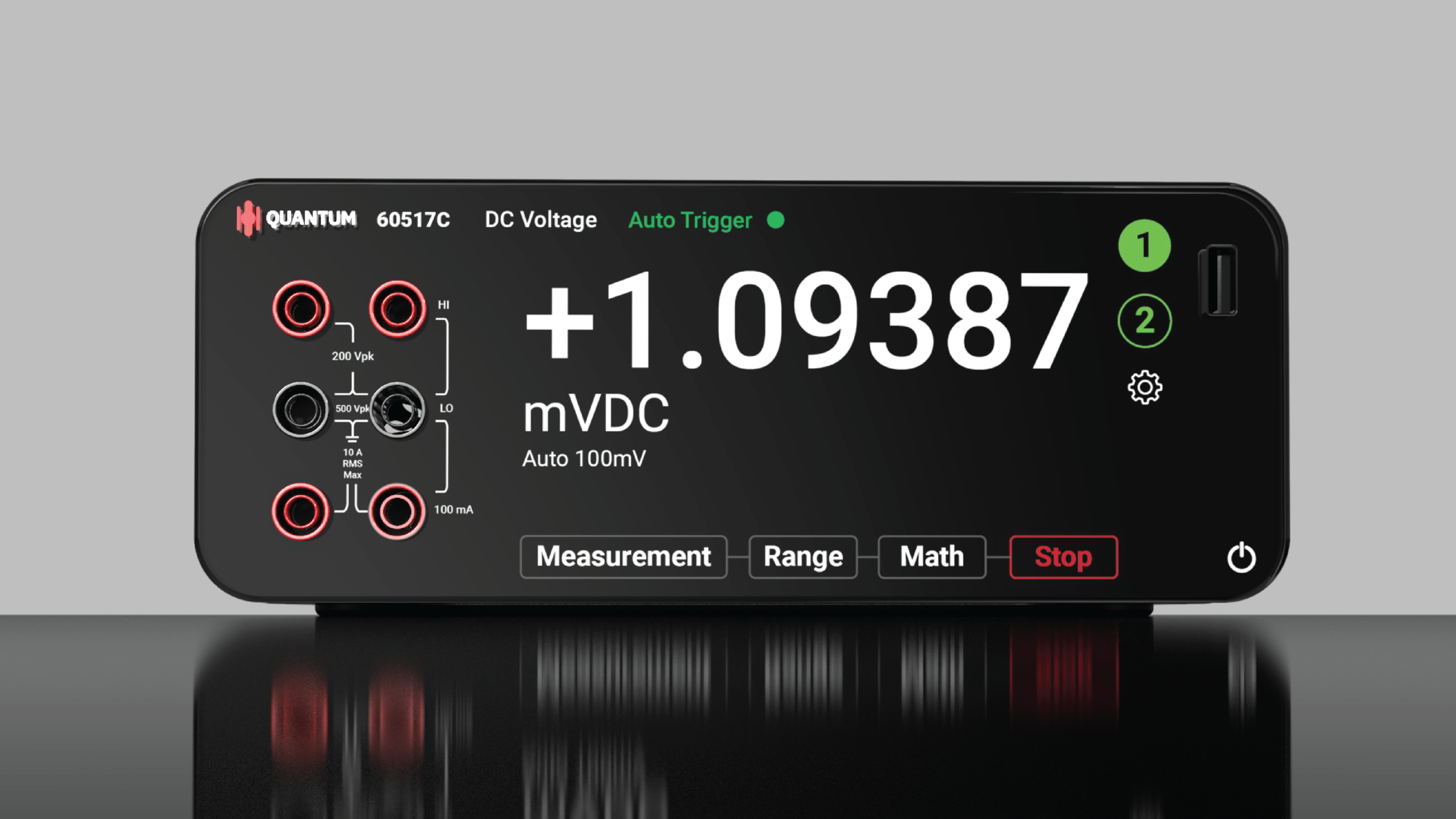
User inputs gathered from
interviews and concept
presentations were used to
ultimately refine the screen to
be not only sleek, but also
practical.
Solution
Stacked
The shape of the rubber plinth (found on the bottom of the product) is
repeated on the top of the product, allowing for easy and secure stacking.
Thanks for viewing!
Feel free to check out my other projects below
Bevi
(Ind. Design)
A new form of reusable
hand-warmers.


